Adding Images to the Site
Images on this site are generally “Lazy Loaded”, which makes adding images a bit harder than just using Markdown to add an image. Lazy loading uses this JavaScript plugin to load images only when they are first viewed. On first load, smaller images downscaled from their originals are loaded, blurred, and displayed on the page. Once the user starts actually looking at an image on their computer or phone, a larger image (whose resolution depends on the size of the device) will replace the lower resolution one. This method of loading images makes the site faster to load and saves users from having to load lots of data on mobile. Serving up device resolution dependent images also ensures that bandwidth isn’t wasted loading images that the user won’t benefit from.
Adding a new image to the site files
New source images that you want to add to the site should be added to the folder _img, and you should expect to load images from the folder assets/img/. A Python script found in the root directory of this site called img-resized.py is used to pull source images from _img and make resized and renamed copies of them assets/img/. The script will mimic the directory structure of _img when copying over files to assets/img/. This means if you want to load an image on the site, for example using the URL /assets/img/my-folder/my-image.jpg, you would first place my-image.jpg into _img/my-folder/ and then run img-resize.py from the root directory to copy it over to the desired location on the site.
The following bash commands show this process in the command line:
$ cd spsatuva.github.io
$ mkdir _img/my-folder
$ cp path/to/my-image.jpg _img/my-folder
$ python img-resize.py
lazy-image.html
Lazy Loading an image in an actual page requires using some templated HTML found in _includes/lazy-image.html. The simplest way you can lazy load an image is to include the following in a page:
{% include lazy-image.html image="my-image.jpg" %}
which will lazyload in an image from /assets/img/my-image.jpg using the following HTML:
<div><img
    data-sizes="auto"
    class="lazyload blur"
    src="https://spsatuva.github.io/assets/img/my-image_placehold.jpg"
    data-srcset="https://spsatuva.github.io/assets/img/my-image_sm.jpg 576w, https://spsatuva.github.io/assets/img/my-image_md.jpg 768w, https://spsatuva.github.io/assets/img/my-image_lg.jpg 992w"
  /><noscript><img src="https://spsatuva.github.io/assets/img/my-image.jpg"/></noscript>
</div>
Here, the data-srcset property sets the set of images that can be loaded, providing a URL to load the image from and the pixel width of the image at which load in this image. For example, if the width is 576 pixels or less, the image my-image_sm.jpg will be loaded in. We can load in a real image for testing using:
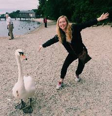
{% include lazy-image.html image="Margaret_Doyle.jpg" base-path="exec" %}
which renders out to:
If we embed some CSS styling into this page, we can change the styling of the image. We will define a class doc-image-test which will be passed to lazy-image.html to add this class to the image:
<style>
    .doc-image-test {
        width: 100%;
        max-height: 400px;
        object-fit: cover;
        object-position: 0% 0%;
        padding: 5px;
        border: 1px solid red
    }
</style>
{% include lazy-image.html image="Margaret_Doyle.jpg" base-path="exec" image-class="doc-image-test" %}
which renders out to:
You can pass any number of classes to image-class to style the image.
All options
All of the options that you can pass to lazy-image.html are found below:
{% include lazy-image.html
    <!-- The image name. If you don't include the extension, it is assumed to be .jpg -->
    image="image_name.jpg"
    <!-- By default, images are assumed to be in /assets/img/. However if they are instead in
         /assets/img/exec/ you want to pass a base-path of "exec" -->
    base-path="exec"
    <!-- If you want to add an <h3> title above the image, pass it in here -->
    title="My Title"
    <!-- If you want to add a caption in a <p> element below the image, pass it in here -->
    caption="My Caption Text"
    <!-- If you want to style the <div> element that wraps the image, pass in a class name here -->
    container-class="my-container-class"
    <!-- If you want to style the <img> element, pass a class name here -->
    image-class="my-image-class"
    <!-- If you want to stlye the <h3> title element, pass a class name here -->
    title-class="my-title-class"
    <!-- If you want to style the <p> caption element, pass a class name here -->
    caption-class="my-caption-class"
%}
Lazy Images in Posts
If you are using a lazy image in a page that has the post layout (i.e. if you see layout: post in the YAML Front Matter), then lazy-image.html behaves a bit differently. In particular, it already assumes you are pulling images from /assets/img/posts/ and unless another class is specified, it passes in post specific classes for the image styling. In other words, using:
{% include lazy-image.html image="image_name.jpg" %}
actually behaves as if you used the following:
{% include lazy-image.html
    image="image_name.jpg"
    base-path="posts"
    container-class="post-image-container"
    image-class="post-image"
    title-class="post-image-title"
    caption-class="post-image-caption"
%}
See _sass/style/post.image.scss/ to see how each item is indivudally styled. You can see this style if we load in a real post image:
{% include lazy-image.html
    image="Eclipse_1.jpg"
    title="The eclipse at UVA"
    caption="It's an Eclipse!!!"
    base-path="posts"
    container-class="post-image-container"
    image-class="post-image"
    title-class="post-image-title"
    caption-class="post-image-caption"
%}
which renders out to:
The eclipse at UVA

SPS hosted an eclipse event!
